
Google Fonts is where most people go when they need a typeface, and it is a genuinely good place to look for dyslexia-friendly text: everything in the library is free, open-licensed, and one line of CSS away. But the library holds well over a thousand families, and only a handful of them were designed with reading difficulty in mind.
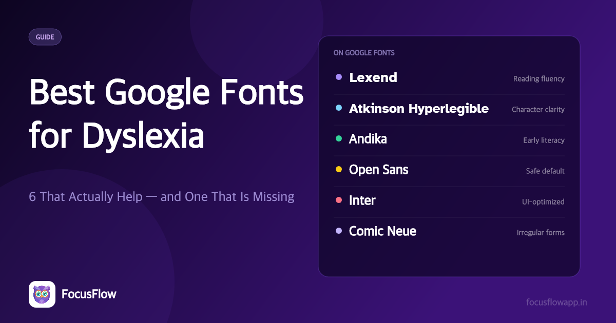
Short answer: the best Google Fonts for dyslexia are Lexend (reading fluency), Atkinson Hyperlegible (character confusion), and Andika (early and returning readers). Open Sans, Inter and Comic Neue are solid second-tier choices. OpenDyslexic is not on Google Fonts — you have to get it elsewhere, and this guide explains how.
What to Look For in a Google Font
Not every clean sans-serif is a dyslexia-friendly sans-serif. The properties that actually matter for readers with dyslexia are narrower than "looks simple":
- Letter differentiation — b/d, p/q, I/l/1 and rn/m should not share a silhouette.
- Generous default spacing — visual crowding is one of the best-documented barriers in dyslexic reading (Zorzi et al., 2012, PNAS).
- Open apertures — the gaps in c, e, s and a should stay wide so the letter resolves fast.
- Low stroke contrast — thick-thin variation costs attention at body sizes.
- A high x-height — taller lowercase letters read better on screens.
- A real italic and bold — faux styles distort the letterforms you just chose carefully.
A font missing any two of these is usually a worse choice than a font that has all six, however "friendly" it looks.
The Best Google Fonts for Dyslexia
1. Lexend — best overall
Lexend was developed by educational therapist Bonnie Shaver-Troup and refined through reading-proficiency research. Its premise is that horizontal spacing, not exotic letter shapes, is the biggest lever on reading speed. That makes it unusual among accessibility fonts: it delivers the benefit while looking like a perfectly ordinary modern sans, so there is no adjustment period and no "my document looks strange" objection.
- Best for: most readers, most of the time — especially anyone who reads a lot of long text
- Watch for: the family ships in several widths (Deca, Exa, Giga, Mega, Peta, Zetta); start with plain Lexend or Lexend Deca
- Weights: variable, 100–900
2. Atkinson Hyperlegible — best for character confusion
Atkinson Hyperlegible was commissioned by the Braille Institute and designed around one goal: make every character as visually unlike every other character as possible. The capital I, lowercase l and digit 1 are unmistakably different. So are O and 0, and so are rn and m.
- Best for: readers who misread similar-looking characters rather than mirrored ones, and for small screens
- Watch for: the original family ships a small set of styles (regular, bold and both italics) — thin on weight options for a full design system
- Weights: 400, 700
3. Andika — best for early and returning readers
Andika was designed by SIL International specifically for literacy work. It uses the single-storey a and g that children learn to write, keeps every letterform unambiguous, and avoids the small joins and spurs that make other fonts harder to decode.
- Best for: children, adult literacy programmes, anyone re-learning to read
- Watch for: the schoolbook character makes it a slightly odd fit for professional documents
- Weights: 400, 700
4. Open Sans — best safe default
Open Sans is not an accessibility font, but it is a well-spaced humanist sans with open apertures, a large x-height and an enormous weight range. When you need something uncontroversial that a whole organisation will accept, this is usually the answer.
- Best for: organisation-wide defaults, body text in long documents
- Watch for: b/d and p/q are not specially differentiated
5. Inter — best for interfaces
Inter was drawn for screens and interface text, with strong letter differentiation at small sizes. It is the most neutral font on this list, which is exactly why it works as a fallback everywhere.
- Best for: UI text, dashboards, anything set below 16px
- Watch for: it does not address crowding as deliberately as Lexend does
6. Comic Neue — the respectable version of the obvious answer
The British Dyslexia Association has long noted that Comic Sans works for some dyslexic readers, because its irregular letterforms are hard to confuse with each other. Comic Neue keeps that irregularity and removes the parts that made Comic Sans a punchline.
- Best for: readers who have found Comic Sans genuinely easier and want something usable in public
- Watch for: still informal; not for formal documents
Quick Comparison
| Font | On Google Fonts | Designed for accessibility | Best for |
|---|---|---|---|
| Lexend | Yes | Yes — reading fluency | Most readers; long-form text |
| Atkinson Hyperlegible | Yes | Yes — low vision | Character confusion (I/l/1, rn/m) |
| Andika | Yes | Yes — literacy | Early and returning readers |
| Open Sans | Yes | No | Safe organisation-wide default |
| Inter | Yes | No | Interface and small text |
| Comic Neue | Yes | No | Readers who get on with Comic Sans |
| OpenDyslexic | No | Yes — letter reversal | b/d and p/q confusion |
Why OpenDyslexic Is Not on Google Fonts
This is the single most common surprise, so it is worth being direct: OpenDyslexic has never been part of the Google Fonts library. It is free and open-source, but it is distributed from opendyslexic.org and from the project's own repository, not through fonts.google.com.
That matters in practice:
- You cannot add it to a Google Doc from the More fonts menu — you need an add-on such as Extensis Fonts.
- You cannot pull it in with a
fonts.googleapis.comstylesheet link — you have to self-host the files and write your own@font-face. - Any list that shows OpenDyslexic among "Google Fonts for dyslexia" is wrong about where it comes from.
If your reader needs OpenDyslexic specifically — which is to say, if their difficulty is mirror-image letters like b/d and p/q — the fastest route is a browser extension that already bundles it, rather than a Google Fonts link.
How to Use These Fonts
On a website you build
Link the family and set it as the body stack. One line, plus a fallback:
<link rel="preconnect" href="https://fonts.googleapis.com">
<link href="https://fonts.googleapis.com/css2?family=Lexend:wght@400;700&display=swap" rel="stylesheet">
body {
  font-family: "Lexend", "Atkinson Hyperlegible", system-ui, sans-serif;
  font-size: 1.125rem;   /* 18px */
  line-height: 1.6;
  letter-spacing: 0.01em;
  max-width: 70ch;
}
The font is only part of the job. Size, line height, line length and spacing carry at least as much weight — the numbers above come from accessible typography for the web.
In Google Docs
Open Font → More fonts and search. Lexend, Atkinson Hyperlegible, Andika, Open Sans, Inter and Comic Neue are all there. OpenDyslexic is not — see dyslexia fonts for Google Docs for the workaround.
On websites you did not build
This is the case Google Fonts cannot help with: you are reading someone else's site and you want it in Lexend. A browser extension has to do it.
FocusFlow is free and bundles eight typefaces — OpenDyslexic, Lexend, Atkinson Hyperlegible, Andika, Comic Neue, Inter, Open Sans and Roboto — so you can apply any of them to any page in one click, then tune size, line height, letter spacing and word spacing on top. Because the fonts ship inside the extension, applying one makes no request to Google Fonts at all.
You can also try the same fonts without installing anything in the free online reader.
Frequently Asked Questions
What is the best Google Font for dyslexia?
Lexend. It was developed through reading-proficiency research, its wider horizontal spacing targets visual crowding directly, and it looks like an ordinary modern sans-serif, so there is no adjustment period. Atkinson Hyperlegible is the better pick if the reader's difficulty is confusing similar-looking characters such as I, l and 1 rather than crowding.
Is OpenDyslexic available on Google Fonts?
No. OpenDyslexic is free and open-source, but it is distributed from opendyslexic.org rather than through the Google Fonts library, so it does not appear in the Google Docs "More fonts" menu and cannot be loaded from fonts.googleapis.com. You either self-host the font files or use a tool that already bundles it, such as the free FocusFlow browser extension.
Are Google Fonts free for commercial use?
Yes. Every family in the Google Fonts library is released under an open licence — most under the SIL Open Font License, some under Apache 2.0 — which permits commercial use, embedding in websites and apps, and redistribution. You still have to keep the licence file when you redistribute the font files themselves.
Is Lexend or Atkinson Hyperlegible better for dyslexia?
They solve different problems. Lexend widens horizontal spacing to reduce visual crowding, which is the barrier most often measured in dyslexia research, and it needs no visual adjustment. Atkinson Hyperlegible exaggerates the difference between similar characters, which helps readers whose errors are substitutions such as rn for m or I for l. Trying both on your own reading material for fifteen minutes settles it faster than any comparison chart.
Does changing the font actually help dyslexic readers?
The evidence supports spacing more strongly than shape. Studies on letter and word spacing show reliable improvements in reading speed and accuracy for dyslexic readers, which is why fonts with generous default spacing — and the ability to increase it further — matter. Results for purpose-built letterforms such as OpenDyslexic are mixed across studies and vary a lot between individuals, so the practical advice is to test rather than assume.
What font size and line height should I use with these fonts?
16px is the floor for body text and 18px is more comfortable for long reading. Set line height between 1.5 and 1.7, keep lines between 60 and 80 characters, and add about 0.01em of letter spacing. Those settings often make a larger difference than the choice of typeface itself.