
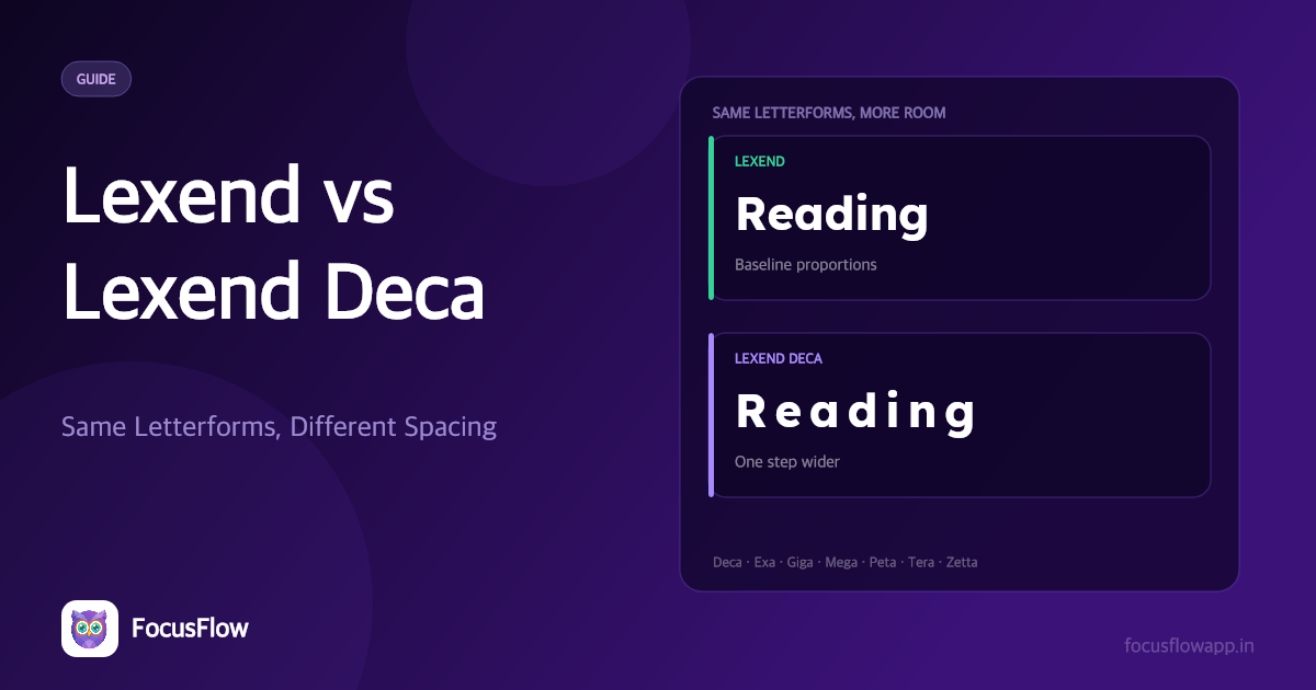
If you have gone looking for Lexend, you have run into the same confusion everyone does: the font menu does not offer one Lexend, it offers several. Lexend, Lexend Deca, Lexend Exa, Lexend Giga, and a few more with increasingly unlikely names.
Short answer: Lexend is the standard family — a variable font with a weight axis and the family's baseline proportions. Lexend Deca is the first step up a deliberate ladder of wider spacing. If you are picking one for body text and have no specific reason to do otherwise, use Lexend. If lines of text still feel crowded, move to Lexend Deca, and keep climbing the series only if it keeps helping.
Why There Is More Than One Lexend
Lexend was created by educational therapist Bonnie Shaver-Troup with type designer Thomas Jockin. The premise behind it is not that dyslexic readers need unusual letter shapes — it is that they need room. Visual crowding, where adjacent letters interfere with each other's recognition, is one of the best-documented barriers in dyslexic reading, and the amount of room any given reader needs varies.
So Lexend was not released as one font. It was released as a graded series of progressively wider variants, named with metric prefixes — Deca, Exa, Giga, Mega, Peta, Tera and Zetta — with Deca as the first and narrowest step beyond the base family.
The intent is diagnostic as much as typographic: a reader moves up the series until text stops feeling crowded, and that variant becomes their setting. It is closer to trying on reading glasses than to picking a brand font.
Google Fonts also offers Lexend itself as a single variable family with a weight axis from 100 to 900, which is what most people actually want for a website or a document.
Lexend vs Lexend Deca: The Practical Difference
| Lexend | Lexend Deca | |
|---|---|---|
| Position in the series | Baseline proportions | First step wider |
| Letterforms | Identical design | Identical design |
| What changes | — | Horizontal spacing and width |
| Best for | Body text, UI, documents, most readers | Readers who still feel crowding at baseline |
| Typical use | Website and document body font | Reading aid; shorter blocks; large-print material |
| Availability | Google Fonts, variable weight 100–900 | Google Fonts, variable weight 100–900 |
The letterforms are the same design. Deca is not a different typeface with different shapes — it is the same shapes given more horizontal room. That is why switching between them does not change the character of a page, only how open it feels.
The trade-off is fit. Wider text means fewer characters per line. On a narrow column or a phone, Lexend Deca can push you into more line breaks and more return sweeps, which is exactly the thing that causes readers to lose their place. Wider is not automatically better; it is better up to the point where it costs you line length.
Which One Should You Use?
Use Lexend if:
- You are setting body text on a website, in a document, or in an interface.
- You want a safe, well-supported default that will not look unusual to anyone.
- You need a range of weights for headings, emphasis and UI states.
Use Lexend Deca if:
- Baseline Lexend still feels tight and your eye keeps slipping between letters.
- You are producing large-print or accessible-format material.
- You are setting short blocks — captions, instructions, worksheets — where line length is not under pressure.
Try a wider variant still (Exa, Giga, Mega and the rest) only if:
- Each one is measurably easier, not just different. These get very wide very fast, and past a point the cost in line length outweighs the benefit in spacing.
A faster method than reasoning about it: apply each one to something you actually have to read and notice where you stop re-reading lines. The free FocusFlow Online Reader lets you paste text and adjust letter and word spacing directly, which gets you to the same answer without installing seven font families.
Is Lexend a Dyslexia-Friendly Font?
Yes — with one honest qualification. Lexend was not designed as a "dyslexia font" in the way OpenDyslexic was. It was designed to improve reading proficiency, and it was built and refined against reading-performance data rather than against a diagnosis.
That turns out to be an advantage rather than a caveat:
- It targets the right barrier. The research base for spacing effects on dyslexic reading is stronger and more consistent than the research base for unusual letterforms. Lexend's whole design is about spacing.
- It has no adjustment period. Lexend looks like an ordinary modern sans-serif. Readers do not have to get used to it, and nobody has to explain why their document looks different.
- It carries no stigma. For older students and adults in particular, a font that visibly signals "accessibility tool" often does not get used. Lexend does not have that problem.
- It scales. The graded series means a reader who needs more spacing has somewhere to go.
The qualification: Lexend addresses crowding. It does not do much for the reader whose specific difficulty is mirror-image letter confusion — flipping b and d, or p and q. For that pattern, OpenDyslexic's bottom-weighted letterforms are the more targeted tool. And for readers who confuse similar-looking characters such as I, l and 1, or rn and m, Atkinson Hyperlegible is designed precisely for that.
Lexend is the best default. It is not the best answer to every reading difficulty.
Is Lexend a Good Font in General?
For body text, yes — and not only for accessibility reasons. It has a large x-height, open apertures, low stroke contrast, a full variable weight range, and an open licence that allows commercial use. Those are the same qualities that make any font a good body font.
Where it is a weaker choice: display and branding work, where its deliberately even spacing reads as neutral rather than distinctive, and very tight interface layouts, where its width costs you more than it gives back. Lexend is a reading font that happens to be pleasant, rather than a personality font that happens to be readable.
Using Lexend Without Installing Anything
FocusFlow ships Lexend as its default typeface and applies it to any website you visit, along with seven other bundled fonts — OpenDyslexic, Atkinson Hyperlegible, Andika, Comic Neue, Inter, Open Sans and Roboto. On top of the typeface you get direct control over the thing Lexend Deca exists to change: letter spacing and word spacing sliders, plus font size and line height.
That is worth knowing, because it means you can get Deca-like spacing out of plain Lexend by nudging one slider, on any page, without hunting through a font menu. The fonts are bundled inside the extension, so applying one makes no request to Google Fonts.
Try Lexend Free on Any Website
Frequently Asked Questions
What is the difference between Lexend and Lexend Deca?
They share identical letterforms. The difference is horizontal spacing: Lexend carries the family's baseline proportions, and Lexend Deca is the first step into a graded series of progressively wider variants (Deca, Exa, Giga, Mega, Peta, Tera and Zetta). Deca gives each line more room, at the cost of fitting fewer characters per line.
Should I use Lexend or Lexend Deca on my website?
Use Lexend. It is the standard family, it has a full variable weight range for headings and interface states, and it will not squeeze your line length on narrow columns or phones. Lexend Deca is better treated as a reading aid for people who still experience crowding at baseline, or for large-print and accessible-format material.
Is Lexend a dyslexia-friendly font?
Yes. Lexend was developed to improve reading proficiency and its design targets visual crowding — the barrier with the most consistent research support in dyslexic reading. It also looks like an ordinary modern sans-serif, so there is no adjustment period and no visible accessibility label. It is less well suited to readers whose specific difficulty is mirror-image letter reversal, where OpenDyslexic is more targeted.
Is Lexend a good font for body text?
Yes. It has a large x-height, open apertures, low stroke contrast and a variable weight axis from 100 to 900, which are the qualities that make any typeface work at reading sizes. It is a weaker choice for display and branding work, where its deliberately even spacing reads as neutral.
Who created Lexend?
Lexend was created by educational therapist Bonnie Shaver-Troup with type designer Thomas Jockin. It was built around the idea that reading performance improves when horizontal spacing is increased, which is why it was released as a graded series of progressively wider variants rather than as a single font.
Is Lexend free to use commercially?
Yes. Lexend is published on Google Fonts under the SIL Open Font License, which permits commercial use, embedding in websites and applications, and redistribution, provided the licence accompanies the font files themselves.