
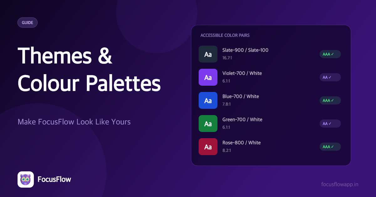
Most extensions give you a dark mode and call it personalization. FocusFlow gives you six interface themes, nine colour palettes, and the ability to change the font and text size of the extension itself — because if you're going to live in a reading tool, it should be readable to you.
Here's how the personalization system works, and how to bend it to your needs.
🌗 Six Themes, Six Moods
Themes paint FocusFlow's own interface — the sidebar, the dashboard, the popup. Cycle through them with the theme button, or pick directly in settings:
- Light — the neutral default.
- Sepia — a warm cream that's easier on the eyes than pure white.
- Quiet — low visual noise, designed with ADHD readers in mind: fewer distractions, calmer surfaces.
- Low saturation — a sensory-friendly, desaturated palette for when colour itself is too much.
- Dark — neutral dark for night reading.
- Dusk — warm, dim, low-glare. The "one more chapter" theme.
Themes are free for everyone.
🎨 Nine Colour Palettes for the Page
Themes and colour palettes are separate on purpose. Palettes supply the swatches that the reading features apply to the web page — so you can run a dark extension UI while laying a warm cream colour overlay over a blinding-white article.
- Choose from nine palettes in settings; each one retunes the swatches across four colour rows at once — the reading ruler, the colour overlay, the text/font colour, and link colours — so the whole page stays consistent.
- The colour overlay offers five palette swatches plus an opacity slider (5–95%), so you can dial the tint to exactly what your eyes want.
- Need a colour the presets don't cover? The custom swatch (Pro) picks any colour you like.
- There's an opt-in setting to make the palettes follow your theme, if you'd rather not choose twice.
🖥️ On the Page, Not Just in Settings
Themes and palettes aren't confined to FocusFlow's own screens — they reach the page too:
- Reader Mode picks up your theme, so the distraction-free view you've tuned feels the same there as in the sidebar.
- The on-page floating tools — the text-to-speech player, the selection button, and the save prompt — use your theme's surface and accent colours, so they blend with what you've chosen rather than clashing with it.
🔤 Change the Font of FocusFlow Itself
FocusFlow styles other people's pages — but its own screens deserve the same care. In Settings → How FocusFlow looks → Reading comfort:
- Interface font: Inter (default), Lexend, Atkinson Hyperlegible, or OpenDyslexic — the same reading-first faces we recommend for the web, applied to the dashboard.
- Text size: three comfortable steps (100%, 112%, 125%), tuned so every layout stays intact.
Each font chip is rendered in the face it offers, so you can see what you're choosing before you commit.
🔒 Private by Design
All of this — theme, palette, interface font, text size — is stored locally on your device and is never synced without your explicit say-so. Your low-saturation evening setup on the family computer stays on the family computer.
Personalization isn't decoration. For readers with dyslexia, ADHD, or sensory sensitivities, the right theme at the right time is the difference between reading for ten minutes and reading for an hour. Set it once — it'll be there every time.