
If you spend more than a couple of hours a day reading on screens, you've probably experienced it — that creeping heaviness behind your eyes, the urge to look away, the feeling that the words are starting to blur together. Screen reading fatigue is real, and it affects far more people than most realize.
The good news: most screen reading fatigue isn't caused by the screen itself. It's caused by how content is presented — tiny fonts, harsh white backgrounds, tight line spacing, and walls of unbroken text. Change the presentation, and the fatigue drops dramatically.
Here's a practical, evidence-based guide to reducing screen reading fatigue using techniques and tools you can start using today.
Why Screen Reading Is More Tiring Than Print
Reading on screens is fundamentally different from reading on paper. Research from multiple studies points to several key reasons:
- Luminance: Screens emit light directly into your eyes, while paper reflects ambient light. This sustained exposure to bright light causes eye muscles to work harder.
- Contrast and glare: The default white background (#FFFFFF) on most websites is far brighter than paper. The harsh contrast between black text and white backgrounds increases visual stress.
- Poor typography: Most websites use default font sizes, line heights, and spacing that are optimized for aesthetics, not readability. Dense paragraphs with tight spacing force your eyes to work overtime to track lines.
- Distractions: Ads, sidebars, pop-ups, and auto-playing videos constantly compete for your attention, forcing your brain to filter out noise while trying to read.
Understanding these causes is the first step to fixing them.
7 Proven Ways to Reduce Screen Reading Fatigue
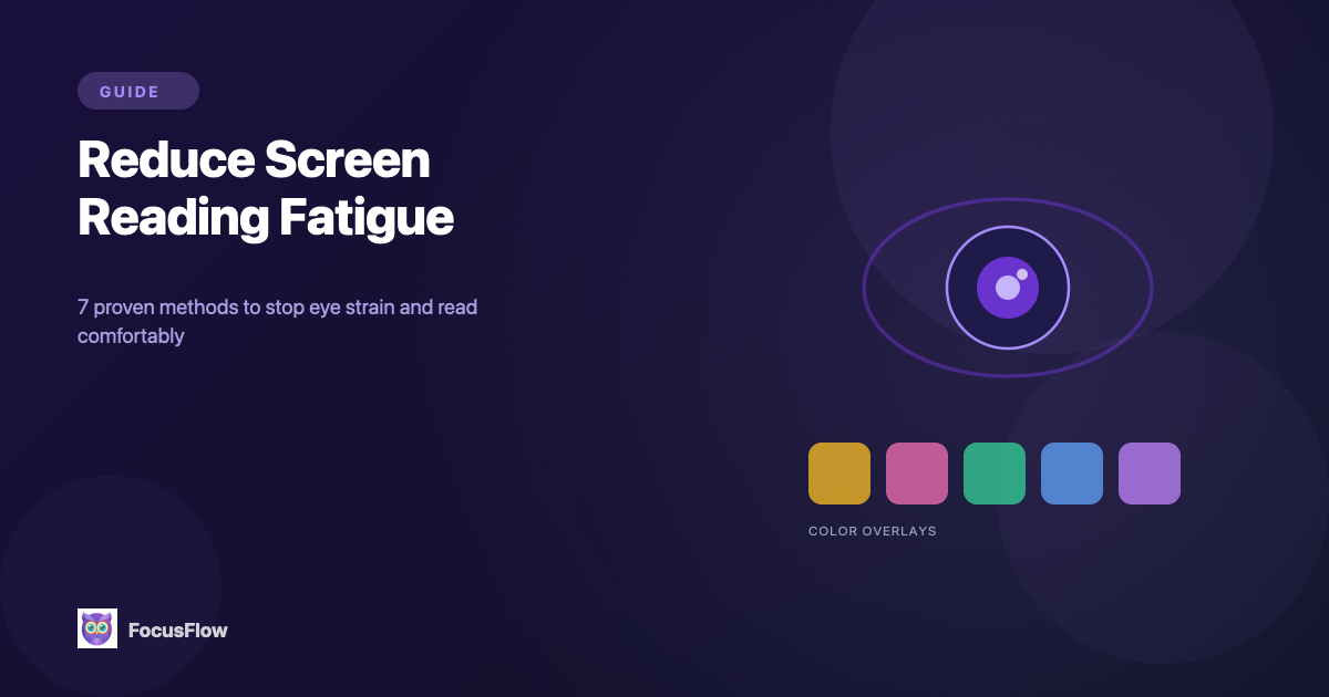
1. Use a Color Overlay to Reduce Glare
The single most impactful change you can make is reducing the brightness of the background. Color overlays apply a tinted filter over the entire page — warm yellow, soft rose, mint green — that reduces the contrast between text and background to a comfortable level.
This isn't just a preference. Color overlays are clinically recommended for people with Irlen Syndrome (scotopic sensitivity), which affects an estimated 12–14% of the population. Even if you don't have Irlen Syndrome, a subtle tint can significantly reduce eye strain during long reading sessions.
How to do it: FocusFlow includes 5 color overlay options with adjustable opacity (5%–50%). Start with a warm yellow at 10–15% opacity and adjust from there.
2. Increase Font Size and Line Height
If you're squinting or leaning toward the screen, the font is too small. Research consistently shows that:
- Font sizes of 16–18px minimum reduce eye strain for most adults
- Line height of 1.5–2x the font size prevents lines from visually merging
- Letter and word spacing adjustments reduce the "crowding effect" that makes dense text hard to parse
Most websites default to 14–16px with tight line height — functional, but not comfortable for extended reading.
How to do it: FocusFlow provides sliders for font size, line height, letter spacing, and word spacing. Adjust these until reading feels effortless, then save the settings as a profile.
3. Switch to a Readability-Optimized Font
Standard web fonts (Arial, Helvetica, Georgia) are general-purpose typefaces. Fonts specifically designed for readability can make a noticeable difference:
- Lexend — Researched at Vanderbilt University, proven to improve reading fluency
- Atkinson Hyperlegible — Designed by the Braille Institute for maximum character distinction
- OpenDyslexic — Weighted letterforms that reduce character confusion
These fonts aren't just for users with dyslexia. Anyone experiencing reading fatigue can benefit from clearer, more distinct letterforms.
How to do it: FocusFlow lets you apply any of these fonts to any website with one click.
4. Use Reader Mode to Strip Away Distractions
Your brain burns a surprising amount of energy filtering out visual noise. Sidebars, banner ads, navigation menus, floating chat widgets — all of these tax your cognitive load even if you're "ignoring" them.
Reader Mode extracts only the article content and presents it in a clean, distraction-free layout. The reduction in cognitive load is immediate and noticeable.
How to do it: FocusFlow's Reader Mode activates with one click. It works with all your other typography settings, so you get clean content with your preferred font, spacing, and overlay.
5. Enable a Reading Ruler or Focus Line
Line tracking — keeping your eyes on the right line of text — is one of the biggest sources of micro-fatigue during reading. When you lose your place, you waste energy scanning back and re-reading.
- Reading Ruler: A colored horizontal bar that follows your cursor, highlighting the current line
- Focus Line (Spotlight Mode): Dims the entire page except the line you're reading, creating a tunnel-vision effect
Both tools dramatically reduce the effort required to track text across wide paragraphs.
How to do it: Toggle either tool from the FocusFlow popup menu. Choose from multiple colors to find what's most comfortable.
6. Try Bionic Reading for Faster Processing
Bionic Reading bolds the first few letters of each word, creating visual "fixation points" that guide your eyes through text. Your brain fills in the rest of each word, reducing the amount of visual processing required.
The result: many readers report being able to read faster with less effort, because their eyes spend less time scanning individual letters.
How to do it: Enable Bionic Reading in FocusFlow's popup. It works alongside all other features — combine it with Reader Mode and a color overlay for the ultimate low-fatigue reading setup.
7. Follow the 20-20-20 Rule
No tool can replace basic eye care. The 20-20-20 rule is the simplest habit for preventing eye strain:
- Every 20 minutes, look at something 20 feet away for 20 seconds
This relaxes the focusing muscles in your eyes that tense up during close-up screen work. Pair this habit with the tools above for the best results.
The Optimal Low-Fatigue Reading Setup
If you want one setup that addresses all the major causes of screen reading fatigue, here's what we recommend:
- Font: Lexend or Atkinson Hyperlegible (16–18px)
- Line height: 1.8x
- Color overlay: Warm yellow at 10–15% opacity
- Reader Mode: On for long articles
- Focus Line: On for dense or academic content
- Bionic Reading: On for faster scanning
Save this as a FocusFlow profile and it applies automatically across every site you visit.
It's Not About Willpower
If you've been pushing through reading fatigue by sheer force, the problem isn't your discipline — it's the defaults. Web content isn't optimized for comfort. The typography is too small, the backgrounds are too bright, and the layouts are too cluttered.
The tools exist to fix this. You just need to use them.