
FocusFlow has always been about making the content of the web easier to read. But there's a part of your browser you stare at every day that we couldn't touch from inside an extension — the browser itself. The toolbar. The tabs. The new-tab page. The blinding white frame around everything.
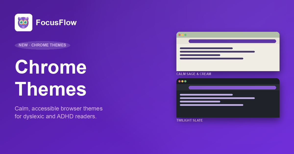
That stops today. We're launching two FocusFlow Chrome Themes — Calm Sage & Cream for daylight, Twilight Slate for evenings — both designed for dyslexic, ADHD, and neurodivergent readers who find the default Chrome look harsh, sterile, or visually fatiguing.
Try them now: Browse the FocusFlow Themes page
Why Browser Themes Matter for Neurodivergent Readers
Most accessibility work focuses on the page you're reading — fonts, contrast, layout. That's important, and it's most of what FocusFlow does. But the browser chrome itself — toolbar, tabs, frame, new-tab page — is in your peripheral vision every second your browser is open. If those colors are wrong for your eyes, every page feels harder to settle into.
Three things in particular cause friction for neurodivergent readers:
- Pure white toolbars (
#FFFFFF) create screen glare and increase visual stress, especially under fluorescent office light or late at night. - Pure black dark modes (
#000000) cause "halation" — text appears to bleed into the surrounding black on high-contrast OLED and LCD displays, which is a documented problem for dyslexic readers. - High-saturation accent colors (the bright Chrome blues and reds) yank attention away from the content you're trying to read — exactly the opposite of what an ADHD reader wants.
Both FocusFlow themes were built specifically to avoid those three traps.
Calm Sage & Cream — The Light Theme
The light theme is built around two ideas borrowed from the world of bookbinding and stationery: warm cream paper and earth-toned ink.
- Frame: Sage Green (
#B2BFA8) — a soft, muted green that recedes visually instead of competing with content. It signals "calm" without being cold. - Toolbar: Cream (
#E8E4D9) — replaces Chrome's default white. The same warmth you'd find on a paperback page. - New Tab Page: Warm Cream (
#F0EDE4) — a fraction lighter than the toolbar, so the visual hierarchy stays intact. - Text: Dark Earth (
#373E3A) — slightly green-leaning charcoal. Pairs naturally with the sage and cream, and clears AAA contrast at 9.4:1 on the new-tab page.
Reaching AAA contrast is the part we're most proud of. WCAG 2.1 AAA requires a contrast ratio of at least 7:1 for body text — most "designer" themes don't even hit AA (4.5:1). Calm Sage & Cream measures 9.4:1 on the new-tab page and 8.6:1 on the toolbar, both comfortably AAA.
It's a theme you can stare at for eight hours without your eyes asking for a break.
Twilight Slate — The Dark Theme
Dark mode is famously divisive among neurodivergent readers. A lot of people switch to dark mode for eye comfort, then find that text starts to shimmer — the optical effect known as halation, where bright text bleeds into the surrounding pure black. For dyslexic readers in particular, halation can make tracking lines noticeably harder.
Twilight Slate avoids it entirely.
- Frame: Deep Slate (
#1A1D24) — dark enough to feel like night mode, but not pure black. The slight blue undertone reduces halation on OLED screens. - Toolbar: Charcoal (
#282C34) — sits just one notch lighter than the frame, giving you visual separation without harsh contrast. - New Tab Page: Dark (
#1F2229) — between the frame and toolbar, deliberately muted. - Text: Off-White (
#E1E5EA) — instead of#FFFFFF. Avoids the eye-piercing brightness of stark white text on dark backgrounds.
Contrast measurements: 12.6:1 on the new-tab page, 13.9:1 on the frame, both well into AAA territory. You get the readability benefits of dark mode without the side effects.
The Science Behind the Color Choices
Every color in both themes was chosen against three constraints, in this order:
- Hit WCAG 2.1 AAA contrast — minimum 7:1 ratio for body text.
- Avoid pure white and pure black — the two endpoints that cause the most reported visual stress.
- Reduce saturation across the palette — fully saturated colors compete for attention; muted earth tones recede.
We also avoided the most common dark-mode mistake: high-saturation accent colors layered on a dark frame. That combination is the visual equivalent of someone tapping you on the shoulder every five seconds. Both themes use desaturated accents that complement the surface colors rather than fighting them.
If you want the full contrast breakdown — text on toolbar, text on frame, text on new-tab page — it's all on the Themes page.
Who These Themes Are For
We built these for specific people we kept hearing from:
- Students with dyslexia who use Chrome on school-issued devices for hours every day and find the default white toolbar exhausting by lunchtime.
- ADHD readers who get pulled out of focus by the high-saturation blues and reds in Chrome's default UI.
- Anyone with photosensitivity, migraine triggers, or visual stress — a category that overlaps significantly with both dyslexia and Irlen syndrome.
- Late-night readers who want a real dark mode that doesn't shimmer.
- Office workers under fluorescent lighting who experience screen glare from default white toolbars.
If any of that sounds like you — or someone you know — these are free, two clicks to install, and either one can be removed in seconds if it isn't right for you.
How to Install
Both themes ship as standalone Chrome Web Store entries. Pick the one you want — or install both and switch between them depending on the time of day.
Chrome installs the theme instantly. To switch back to the default look or swap themes, head to chrome://settings/appearance and use the Reset to default button — themes never lock you in.
Pair Them with the FocusFlow Extension
A theme changes the frame around your content. The FocusFlow extension changes the content itself — fonts, spacing, color overlays, reading rulers, bionic reading, reader mode. Together, they cover both halves of the visual experience.
Theme + extension is the setup we recommend to anyone with dyslexia, ADHD, or general visual stress. Both are completely free.
Try a Calmer Browser
Open the Themes page for the full color breakdown, contrast tables, and side-by-side previews of both themes. Pick one, install it, and see how a calmer frame around your tabs changes the way an hour of browsing actually feels.
As always, FocusFlow themes are free, completely private — Chrome themes don't collect any data — and uninstall in seconds if they're not for you.