
Choosing the right font can make a dramatic difference for readers with dyslexia. Standard web fonts like Arial or Times New Roman weren't designed with readability challenges in mind — their uniform letter shapes, tight spacing, and mirrored characters (like b and d) can make reading slow, exhausting, and error-prone.
In this guide, we'll break down the best dyslexia-friendly fonts available for the web, explain what makes them effective, and show you how to use them on any website with FocusFlow.
What Makes a Font Dyslexia-Friendly?
Before we dive into specific fonts, it helps to understand what research says about typography and dyslexia. A good dyslexia font typically has these properties:
- Distinct letterforms: Letters like b/d, p/q, and m/n are visually differentiated so they're harder to confuse.
- Weighted bottoms: Heavier strokes at the base of letters give each character a visual "anchor" that reduces perceived movement.
- Generous spacing: Wider letter spacing and word spacing reduce visual crowding, which is one of the biggest barriers for dyslexic readers.
- Simple, clean shapes: Avoiding decorative serifs and overly thin strokes makes each letter easier to identify.
The 3 Best Dyslexia Fonts for Web Reading
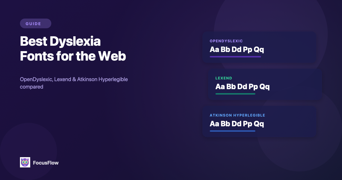
1. OpenDyslexic
OpenDyslexic is the most widely recognized dyslexia font. It was specifically designed for readers with dyslexia, with heavy-bottomed letter shapes that create a visual "gravity" — making it harder for your brain to rotate or flip letters.
- Best for: Readers who frequently confuse mirror-image letters (b/d, p/q)
- Style: Sans-serif with weighted bottoms and unique character shapes
- Why it works: The asymmetric letterforms give each character a distinct identity, reducing the visual confusion that causes reading errors
OpenDyslexic is open-source and free to use, making it one of the most accessible options available.
2. Lexend
Lexend is a font family developed through research at Vanderbilt University, designed to improve reading fluency for everyone — not just dyslexic readers. It uses optimized letter spacing and simplified shapes based on actual reading performance data.
- Best for: Readers who want improved reading speed and reduced eye strain across all types of content
- Style: Clean, modern sans-serif with research-backed spacing
- Why it works: Lexend was tested across thousands of readers and shown to measurably improve reading speed. Its variable width options let you find the exact balance of spacing that works for you
3. Atkinson Hyperlegible
Atkinson Hyperlegible was created by the Braille Institute with a specific goal: maximize the distinction between every character. Each letter was designed to be as different as possible from every other letter, even at small sizes or in low-contrast situations.
- Best for: Readers with low vision, aging eyes, or anyone reading on smaller screens
- Style: Humanist sans-serif with exaggerated character differentiation
- Why it works: Where most fonts aim for visual consistency, Atkinson deliberately breaks uniformity so that similar-looking letters (like I, l, 1 or O, 0) are immediately distinguishable
Lexend vs OpenDyslexic: Which Is Better?
This is the most common question we get, and the honest answer is: they're solving different problems.
- OpenDyslexic is built specifically for diagnosed dyslexia. Its weighted-bottom letterforms are designed to stop letter rotation and mirroring (b/d, p/q confusion). It looks unusual, and that unfamiliarity can actually slow you down at first — but for readers who regularly flip letters, it's the most targeted fix.
- Lexend is built on reading-speed research across all readers. It looks like a normal modern sans-serif, so there's no adjustment period, and Vanderbilt's studies showed measurable reading-speed gains even for readers without dyslexia.
Choose OpenDyslexic if you have diagnosed dyslexia and struggle with mirror-image letters. Choose Lexend if you want faster reading without a font that stands out visually, or if OpenDyslexic feels too distracting after a few days of use. With FocusFlow you can switch between them per-site, so you don't have to commit to one.
Lexend vs Atkinson Hyperlegible: Which Is Better?
Both are research-backed modern sans-serifs, but they optimize for different goals:
- Lexend optimizes for reading speed. Its letter spacing and proportions were tuned using reading-fluency studies. If your goal is to get through long articles, textbooks, or documentation faster, Lexend is the better pick.
- Atkinson Hyperlegible optimizes for character recognition. The Braille Institute deliberately designed every letter to look as different as possible from every other letter. That's a huge win for low vision, aging eyes, and small-screen reading — but it's not specifically tuned for speed on long-form text.
Choose Lexend if your main issue is reading fatigue or slow reading on long content. Choose Atkinson Hyperlegible if you have low vision, frequently misread similar characters (I/l/1, O/0), or read mostly short content on small screens.
How Typography Settings Affect Readability
Swapping the font is only half the equation. Research consistently shows that spacing and size matter just as much as the typeface itself:
| Setting | Why It Matters |
|---|---|
| Font size | Larger text reduces visual crowding and eye strain. Most dyslexic readers benefit from at least 16–18px. |
| Line height | Generous line spacing (1.5–2x) prevents lines from blending together. |
| Letter spacing | Wider tracking reduces the "crowding effect" that makes adjacent letters interfere with each other. |
| Word spacing | More space between words helps the brain parse word boundaries faster. |
The ideal settings are personal. What works for one reader may feel too spread out for another. That's why adjustability matters more than any single "best" setting.
How to Use Dyslexia Fonts on Any Website
You don't need to wait for website owners to add accessible fonts. With FocusFlow, you can apply OpenDyslexic, Lexend, or Atkinson Hyperlegible to any webpage instantly:
- Install FocusFlow from the Chrome Web Store — it's free
- Click the FocusFlow icon in your toolbar and choose your preferred font
- Adjust typography settings — fine-tune font size, line height, letter spacing, and word spacing with intuitive sliders
- Save a profile so your settings are remembered and applied automatically
FocusFlow remembers your preferences per website, so your favorite news site can use Lexend while your study materials use OpenDyslexic — without switching anything manually.
Which Font Should You Choose?
There's no single "best" font for everyone. Here's a quick guide:
- Start with OpenDyslexic if you have diagnosed dyslexia and want the strongest letter differentiation
- Try Lexend if you want improved speed and fluency across general reading
- Choose Atkinson Hyperlegible if you have low vision or read a lot on mobile screens
The best approach is to try all three and see which one feels most comfortable after 15–20 minutes of reading. FocusFlow makes switching between them instant, so you can experiment freely.
Beyond Fonts: A Complete Reading Experience
Fonts are just the starting point. For a truly accessible reading experience, consider combining your chosen font with:
- Color overlays to reduce visual stress from bright white backgrounds
- Focus Line / Spotlight mode to eliminate distractions and track lines more easily
- Reader Mode to strip away ads and clutter entirely
- Bionic Reading to create fixation points that guide your eyes through text faster
All of these tools are included free in FocusFlow and designed to work together seamlessly.
Frequently Asked Questions
Is Lexend a dyslexia-friendly font?
Yes. While Lexend wasn't designed exclusively for dyslexia, it was developed at Vanderbilt University using research on reading fluency, and its wider letter spacing and simplified shapes measurably improve reading speed — including for readers with dyslexia. Many dyslexic readers prefer Lexend over OpenDyslexic because it looks like a normal modern font while still delivering accessibility benefits.
Is Atkinson Hyperlegible good for dyslexia?
Atkinson Hyperlegible was designed by the Braille Institute primarily for low vision, not dyslexia specifically. However, its exaggerated character differentiation — where every letter is made as visually distinct as possible — helps dyslexic readers who confuse similar-looking letters like I/l/1 or O/0. It's a strong second choice after OpenDyslexic or Lexend, especially on smaller screens.
What is the best dyslexia font in 2026?
There's no single "best" font — it depends on your specific reading challenge. For diagnosed dyslexia with letter-reversal issues, OpenDyslexic is the most targeted. For general reading speed and fluency, Lexend is backed by the strongest research. For low vision combined with dyslexia, Atkinson Hyperlegible wins on character distinction. The best approach is to try all three and pick what feels most comfortable after 15–20 minutes of real reading.
Can I use these dyslexia fonts on any website for free?
Yes. All three fonts (OpenDyslexic, Lexend, and Atkinson Hyperlegible) are free and open-source. FocusFlow is a free Chrome extension that applies any of them to any website instantly — including sites that don't offer accessibility settings of their own.